library(tidyverse)
library(pxweb)
library(geomtextpath)
library(patchwork)ggplot2 is an excellent tool for easily graphing data in all stages of the data analysis pipeline, whether for exploratory visualization, model performance, or prediction results. It manages to be both easy to use and powerful for tailoring plots to one’s preference - especially when considering add-on packages such as ggtext, GGAlly, wesanderson, patchwork, and more.
in this post I show how I usually go about prettifying a simple graph. I find small adjustments to really enhance the eye-grabbyness of a plot, and could make all the difference at a conference poster session or presentation - as well as in a journal submission!
 >>>
>>> 
Libraries used:
Getting some data
Let’s use pxweb to get some rando’ statistics from the Swedish Department of Energy’s publicly available API. pxweb_interactive() makes browsing PX API’s a breeze. This time I went for the table “Production of disintegrated unprocessed primary forest fuels of domestic origin by assortment, GWh”. Primary forest fuels are
# Start the interactive inteface with a px endpoint
pxweb_interactive("https://pxexternal.energimyndigheten.se/api/v1/en")
The console prints the commands needed to download the date you browse to, so it’s just a matter of copy/paste:
# PXWEB query
pxweb_query_list <-
  list("År"=c("0","1","2","3","4","5","6","7","8"),
       "Sortiment"=c("0","1","2","3","4","5"))

# Download data
px_data <-
  pxweb_get(url = "https://pxexternal.energimyndigheten.se/api/v1/en/Produktion,%20import%20och%20export%20av%20of%C3%B6r%C3%A4dlade%20tr%C3%A4dbr%C3%A4nslen/EN0122_3.px",
            query = pxweb_query_list)
It also spits out commands for turning the list into a dataframe, which we will clean a bit further by making it into a tibble and using the exquisite janitor package:
pff_init <-
  as.data.frame(px_data,
                column.name.type = "text",
                variable.value.type = "text") %>%
  tibble() %>%
  janitor::clean_names() %>%
  rename(production = starts_with("production"))
Basic plotting
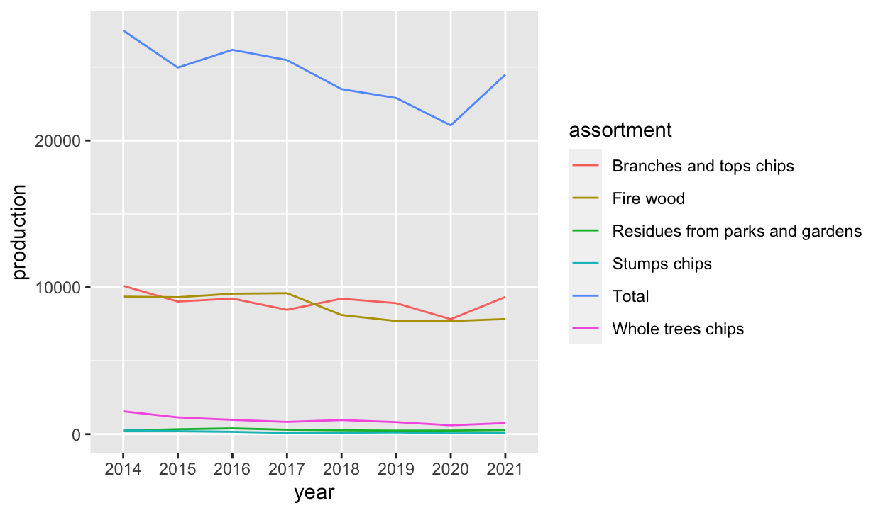
pff_init %>%
  ggplot(aes(year, production, group = assortment, color = assortment)) +
  geom_line()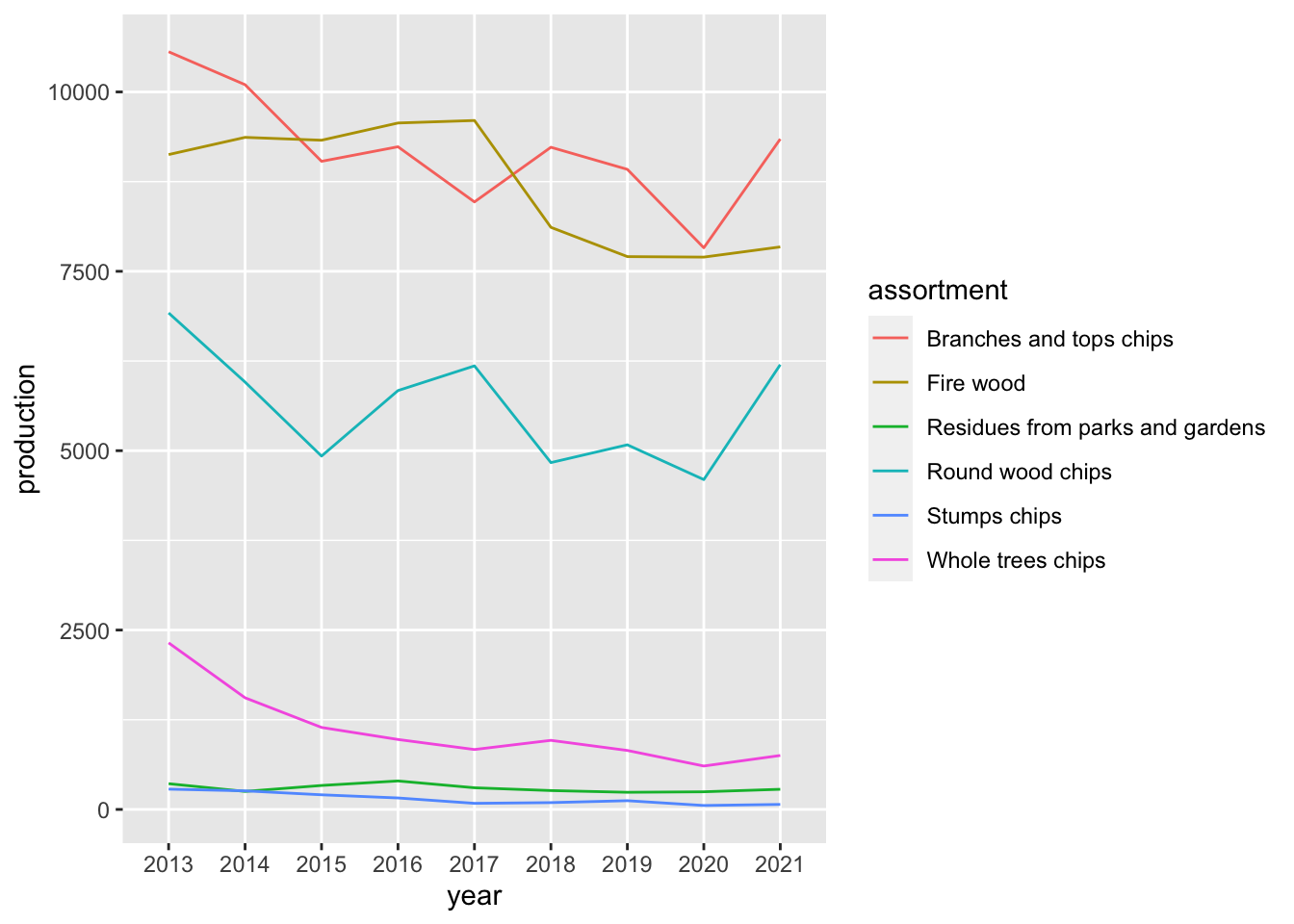
Ok, I admit the plot above is too basic to be presented in an article, on a presentation, or even a poster. But honestly, we all see this way too often.
Let’s see how we can improve it, piece by piece. First, we’ll break it down a bit to enhance the interpretability by providing two perspectives that might help guide the reader towards the message potentially conveyed - ratios and totals.
We want to focus on the larger assortments in this dataset, it looks like some could be bunched together:
pff_init %>%
  count(assortment, wt = production) %>%
  rename(total_production = n)
# A tibble: 6 × 2
assortment total_production
<chr> <dbl>
1 Branches and tops chips 82719
2 Fire wood 78346
3 Residues from parks and gardens 2672
4 Round wood chips 50533
5 Stumps chips 1333
6 Whole trees chips 9973Yup, let’s bunch ’em:
pff <-
  pff_init %>%
  mutate(assortment = if_else(
     str_detect(assortment, "Residues|Stumps|Whole"),
    "Other", assortment)) %>%
  group_by(year, assortment) %>%
  summarise(production = sum(production), .groups = "keep") %>%
  arrange(production) %>%
  ungroup()
So, lets start by creating a plot showing the relative change of PFF sources over time. To have control over label positions, i use mutate to iteratively plot and adjust the hjust and vjust arguments of geom_textpath.
 p1 <-
  pff %>%

  # Prepare the data with ratios and convert to long format
  pivot_wider(names_from = assortment, values_from = production) %>%
  mutate(sums = rowSums(across(2:5))) %>%
  mutate(across(2:5, ~ . / sums)) %>%
  select(-6) %>%
  pivot_longer(cols = 2:5) %>%

  # Mutate variables for more control of label positions and faceting
  mutate(
    h_just = case_when(
      str_detect(name, "Fire") ~ 0.6,
      str_detect(name, "Branches") ~ 0.75,
      str_detect(name, "Round") ~ 0.7,
      str_detect(name, "Other") ~ 0.7),
    v_just = case_when(
      str_detect(name, "Fire") ~ 2,
      str_detect(name, "Branches") ~ -0.5,
      str_detect(name, "Round") ~ 3.5,
      str_detect(name, "Other") ~ 2),
    name = if_else(str_detect(name, "Branches"), "Branches\nand tops chips", name)
    ) %>%

  # Start plotting!
  ggplot(aes(year, value, group = name, color = name)) +

  # First, a basic line
  geom_line(
    linewidth = 1.2,
    alpha = 0.8
  )+

  # Then, add some points with nice white strokes
  geom_point(aes(fill = name),
             pch = 21,
             size = 2,
             stroke = 0.5,
             color = "white",
             alpha = 0.8)+

  # text along the plotted lines
  geom_textpath(
    aes(label = name, hjust = h_just, vjust = v_just),
    linewidth = 1.1,
    text_smoothing = 60, text_only = T) +

  # wesanderson adds some sweet color schemes based on iconic movies
  scale_color_manual(
    values = wesanderson::wes_palette(
      "Cavalcanti1", type = "continuous", n = 4))+
  scale_fill_manual(
    values = wesanderson::wes_palette(
      "Cavalcanti1", type = "continuous", n = 4))+

  # turn y values into percent
  scale_y_continuous(
    labels = scales::percent_format(accuracy = 1),
    # breaks = c(0, 0.05, 0.1, 0.3, 0.35, 0.4)
    breaks = seq(0, 0.4, 0.05), limits = c(0, 0.4)
  ) +


  # set x axis labels
  scale_x_discrete(breaks = as.character(c(2014, 2016, 2018, 2020, 2021))) +

  # annotation
  labs(
    title = "Proportions of PFF production",
    x = NULL,
    y = NULL
  ) +

  # Theme magic
  theme(
    text = element_text(family = "Helvetica", size = 14),
    plot.title = element_text(size = 12),
    strip.text = element_blank(),
    panel.background = element_rect(fill = "white"),
    panel.grid = element_blank(),
    panel.grid.major.y = element_line(colour = "gray90"),
    panel.spacing = unit(10, "mm"),
    axis.line.y = element_line(color = "gray90"),
    legend.position = "none",
    axis.ticks.length.y = unit(0, "mm")
    )

p1
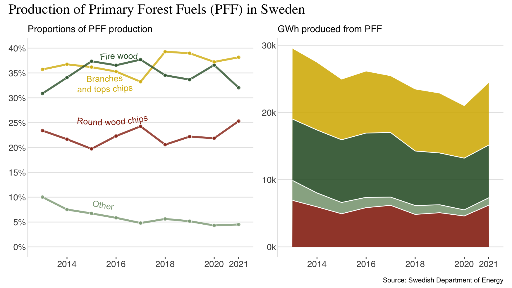
It’s not perfect, but its a start! We should add a plot showing absolute values of the production - like a stacked area chart!
p2 <-
  pff %>%

  # No need for labeling this plot - colors should be the same as before
  ggplot() +

  # Stacked area chart
  geom_area(
    aes(year, production, group = assortment, fill = assortment),
    color = "white", alpha = 0.9
  )+

  # x axis labels, y axis reformatting, color assignment, and labels
  scale_x_discrete(breaks = as.character(c(2014, 2016, 2018, 2020, 2021)))+
  scale_y_continuous(labels = scales::number_format(scale = 0.001, suffix = "k"))+
  scale_fill_manual(values = wesanderson::wes_palette("Cavalcanti1", type = "continuous", n = 4))+
  labs(
    title = "GWh produced from PFF",
    x = NULL,
    y = NULL
  ) +

  # Themin'! yay!
  theme(
    text = element_text(family = "Helvetica", size = 14),
    plot.title = element_text(size = 12, family = "sans"),
    strip.text = element_blank(),
    panel.background = element_rect(fill = "white"),
    panel.grid = element_blank(),
    panel.grid.major.y = element_line(colour = "gray90"),
    panel.spacing = unit(15, "mm"),
    axis.line.y = element_line(color = "gray90"),
    legend.position = "none",
    axis.ticks.length.y = unit(0, "mm")
  )
I love colors like this! Now to put it all together using patchwork:
p1 + p2 +
  plot_annotation(title = "Production of Primary Forest Fuels (PFF) in Sweden",
                  theme = theme(plot.title = element_text(family = "serif", size = 18)),
                  caption = "Source: Swedish Department of Energy")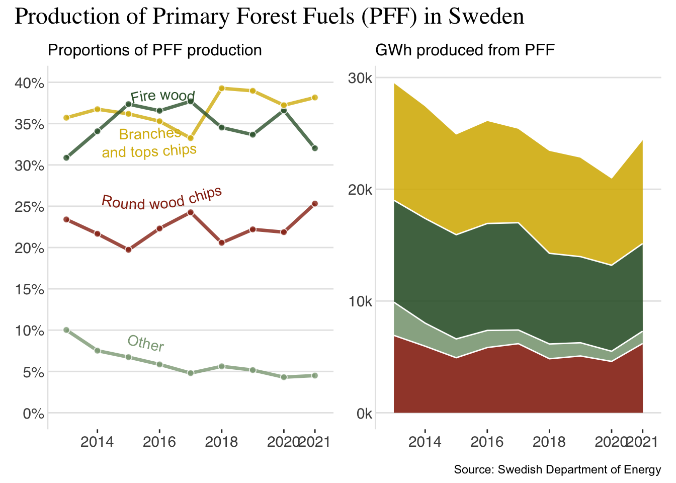
Is it better? Maybe. I don’t pretend to propose that this is the way to go, this code is not super effective or anything. There’s still work to be done if this were to take center stage in a conference presentation or a poster - but for me the plot looks a lot more fun!